Delightfully artistic and skilfully handcrafted, the creation of lettered rock remains a cherished testament to the expertise of sugar confectioners. It’s a practice which beautifully marries traditional hand methods with creativity, yielding a range of enchanting results from intricate inscriptions to floral and figurative designs.
The journey to crafting these sugary masterpieces commences with the preparation of a sugar/glucose syrup blend (36-38 DE) in a two to one ratio. The concoction reaches its optimal consistency at a boiling temperature of 146 C (295 F), and is ideally managed in batches ranging from 25-50 kg for ease of handling on the slab.
Post-boiling, the sugary canvas is poured onto a Cold Table, flavoured, and allowed to cool. Approximately two-thirds of the batch is then carefully separated and pulled. A portion of the remaining third is saturated with your preferred colour, destined to form the letters, while the rest assumes a contrasting colour, set aside for the exterior wrapping. The exact measurements are provided in our handy diagram.
The technique of pulling, while achievable by hand, employs a rhythmic method of folding, stretching and pulling the sugar over a Pulling Hook mounted on a wall bracket, roughly 1.5 metres off the ground. Pulling Machines can also serve this purpose. This repetitive process invites air into the sugar, expanding its volume and transforming its texture into a more malleable state, which is ideal for formation.
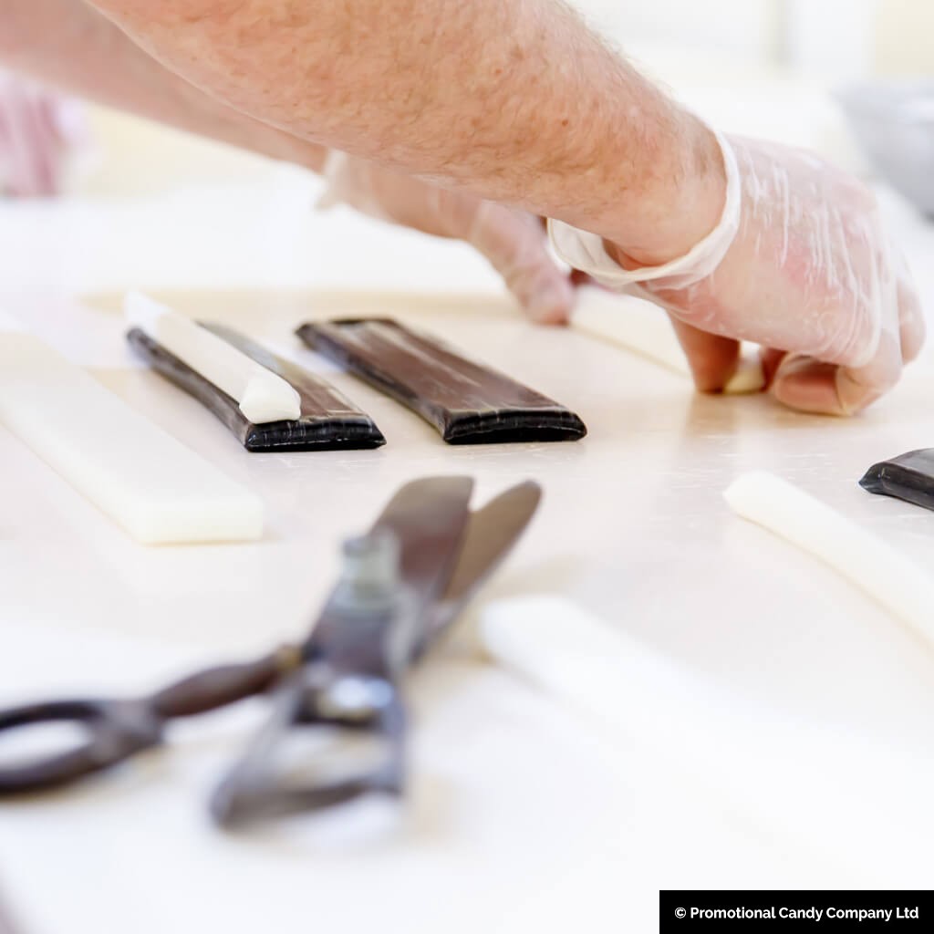
Creating the letters (please refer to diagrams) requires a keen eye and a steady hand. Each letter requires a specific assembly of coloured and white strips, moulded and intertwined in a unique pattern. From the ‘A’ with its two equal strips of colour and narrower strip of white, to the ‘Z’ with its three pieces of coloured candy with white, each letter bears its own unique formation process.
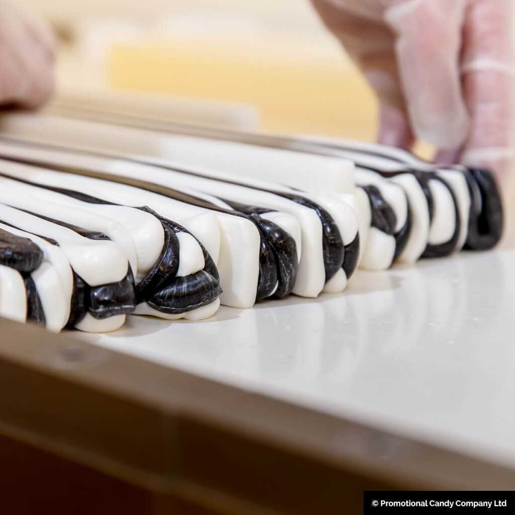
Once the letters are meticulously assembled to spell out the desired name or message, they are neatly lined up. It’s important to note that for central legibility, the letters need to be arranged upside down. Each letter is separated by a strip of pulled sugar, and this linear arrangement is then encased in a cylinder of pulled sugar. This cylinder is enveloped in a shell of a different coloured sugar to form the outer skin.
The lettering is usually done on Hot Table, to keep the batch warm while it is being worked, which increases the time the master confectioner has to assemble the work of art.
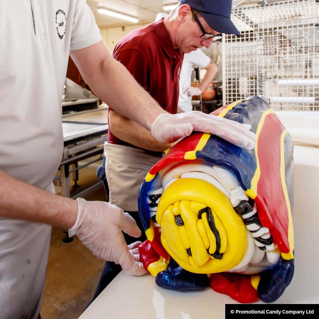
To finalise the process, the entire cylinder is elongated either by hand or via a Batch Roller into a continuous rope, which is then cut into the required stick lengths. And voila! Your personalised lettered rock is ready for enjoyment.
Each letter requires a specific assembly, and for the example here we will use colours of black and white strips, moulded and intertwined in a unique pattern. (You can change these colours to whatever you like)
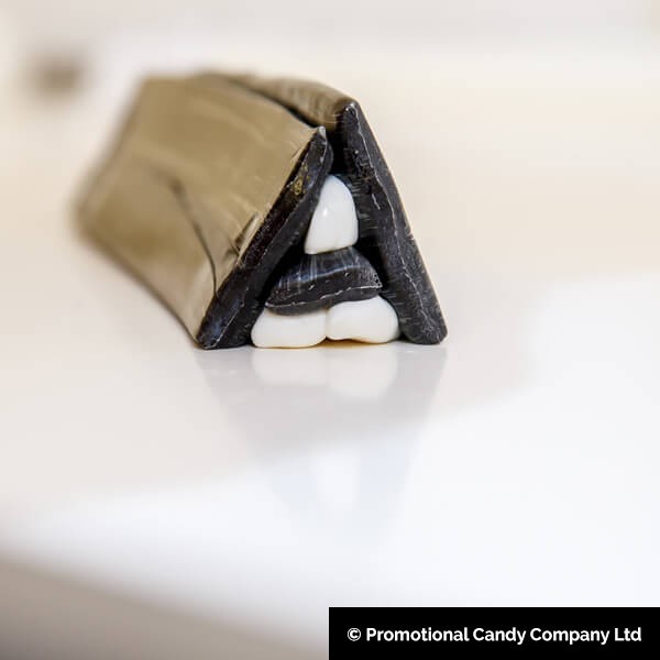
‘A‘ is formed with two equal strips of black (1 and 2) and a narrower strip (3). A piece of pulled white is shaped as a ‘V’ and placed on top of strip (3). Another piece of white is shaped to form the white section under the ‘V’ and put under No. 3. Taper to a point and place pieces 1 and 2 on each side.
‘B‘ is composed of one broad strip of black to form the upright of the letter and two narrow strips to form the two loops. Rounded pieces of white are placed on Nos 2 and 3 and shaped as if the ‘B’ was resting on a vertical base. Place on top of No. 1.
‘C‘ only requires one oblong piece of black . A piece of pulled white is rolled and placed in the middle of the red (make sure that the edges do not meet).
‘D‘ is relatively simple. It consists of one piece of black for the upright leg, another for the round back, and one roll of pulled white for the inside filling of the letter.
‘E‘ requires one piece of black for its upright leg and three other pieces of less depth for the three branches. The branches are filled in with two rolls of white and the whole is shaped into a neat oblong.
‘F‘ is similar to ‘E’, but without the bottom branch of black . It should also form a neat oblong.
‘G‘ resembles the letter ‘C’, but with a little tail added.
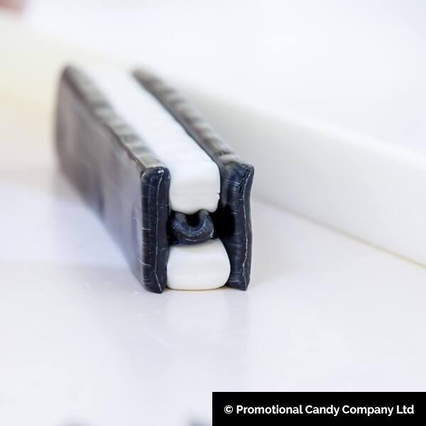
‘H‘ necessitates two large pieces of black for the two upright legs and one piece for the centre cross piece. The centre piece is topped and bottomed with white and the two uprights put on either side.
‘I‘ only needs one piece of dark red to stand upright. It is preferable if the dark red is supported on each side with a layer of white.
‘J‘ is akin to ‘I’, but longer to allow for the half loop. A piece of pulled white is shaped and a loop of red is formed around the base.
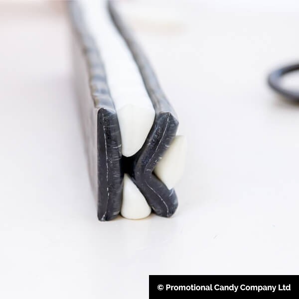
‘K‘ demands one large piece of black for the upright leg and two other pieces for the sloping branches. Two V-shaped pieces of white are formed, branches are added, and pulled white is placed in the centre.
‘L‘ has one upright leg and a smaller piece to branch off at the base. This is then filled in with a neat oblong of white.
‘M‘ has two upright legs and two pieces to form a ‘V’ shape to be placed between the uprights. Fill in with white and form into a square.
‘N‘ consists of three black pieces and two pieces of V-shaped white. The sloping piece connects the upright at opposite ends.
‘O‘ is formed with one piece of black , inside which a round roll of white is placed. Allow the letter to flatten slightly to form an oval.
‘P‘ comprises an upright and a loop, which is filled with white.
‘Q‘ follows the pattern of ‘O’, but with the addition of a tail at its base. Ensure the tail extends out on one side.
‘R‘ has an upright, a sloped half-leg, and a top loop, all filled in with white.
‘S‘ consists of one large piece of black . Roll two pieces of white of equal size and place one on each side of the red. By placing them on the reversed side and not allowing the edges of red to meet, the letter will form.
‘T‘ requires an upright leg and a top crosspiece, which are then filled in with white.
‘U‘ is composed of a single piece of black , filled in with a round piece of white and slightly flattened on either side.
‘V‘ necessitates two pieces of black . A ‘V’ shaped piece of white is then shaped and laid on the red pieces. The structure is tapered to a fine point and filled in with white.
‘W‘ requires four black pieces. Two ‘V’ shapes are formed and joined with ‘V’ shaped white pieces extending up to the centre of the two ‘Vs’.
‘X‘ is crafted by forming a ‘V’ large enough to divide. The top and bottom are filled with white, which is then spread to each side.
‘Y‘ is formed from a ‘V’ shape made with two pieces of black , placed on a half upright. Each side is then filled with white.
‘Z‘ involves three pieces of black , the diagonal piece being a little longer than the others. The shape is then filled in with white.

Once all the letters are carefully crafted and arranged to spell out the desired word or phrase, they are laid out side by side. They are then separated by strips of pulled sugar, and the entire line is wrapped around a mass of pulled sugar to form a cylinder. This is covered with the pink coloured sugar skin, resulting in a cylindrical shape that can be stretched out by hand, or placed in a batch roller and spun out to a continuous rope, which can be cut to the required stick lengths.
Thanks to Promotional Candy Company for providing the excellent images used throughout this article.
Jason is a master confectioner producing the highest quality lettered rock and logo sweets”
